Burn it down to build it right
See the product we scrapped and why.
Company
Graft
Industry
AI
Tags
AI UX
Redesign & Refactoring
Product Strategy
Duration
6 months

The Breaking Point
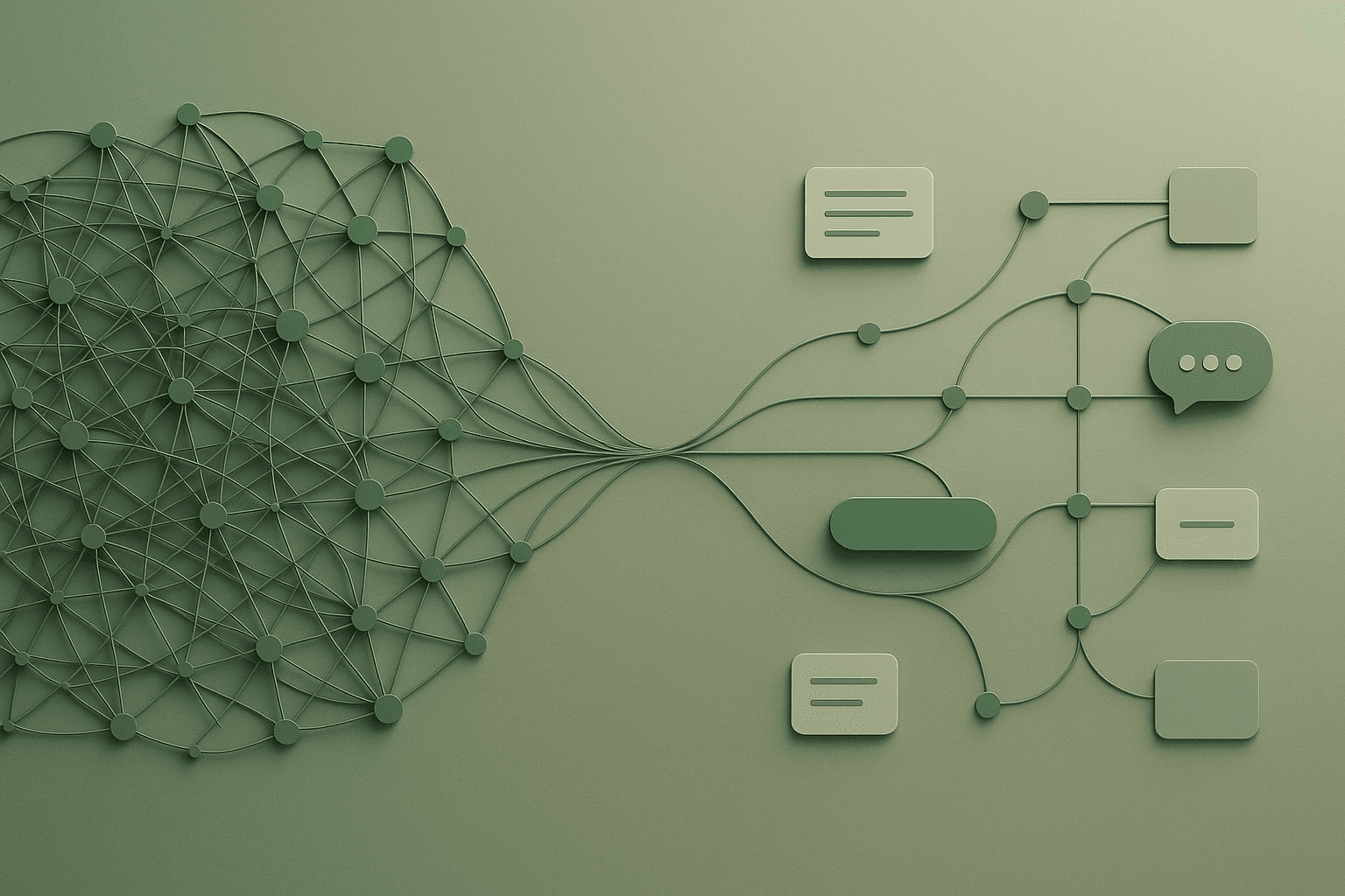
By mid-2024, Graft had become a technically impressive, but cognitively exhausting, AI platform. We layered on capabilities like data source connections, embedding pipelines, enrichments, entity management, and SQL-based querying to compensate for core usability gaps. Each was powerful in isolation, but together, they overwhelmed the user. “I didn’t want to polish the edges, I wanted to tear it down and rebuild something people could finally use.” I initiated internal brainstorms to reimagine the product from the ground up. We partnered with an outside strategist, ran a full-team design sprint, and aligned around a simpler structure. But even then, it still felt like Graft 3.0, smaller, not simpler. So I pushed further.
Systemic Simplification
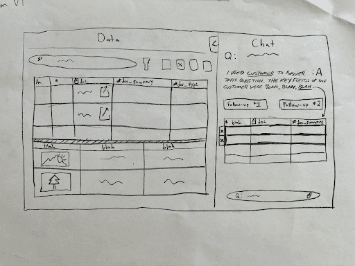
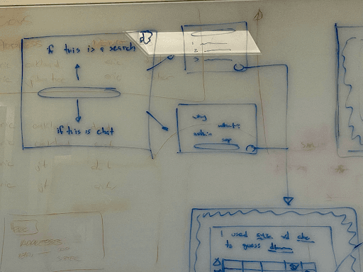
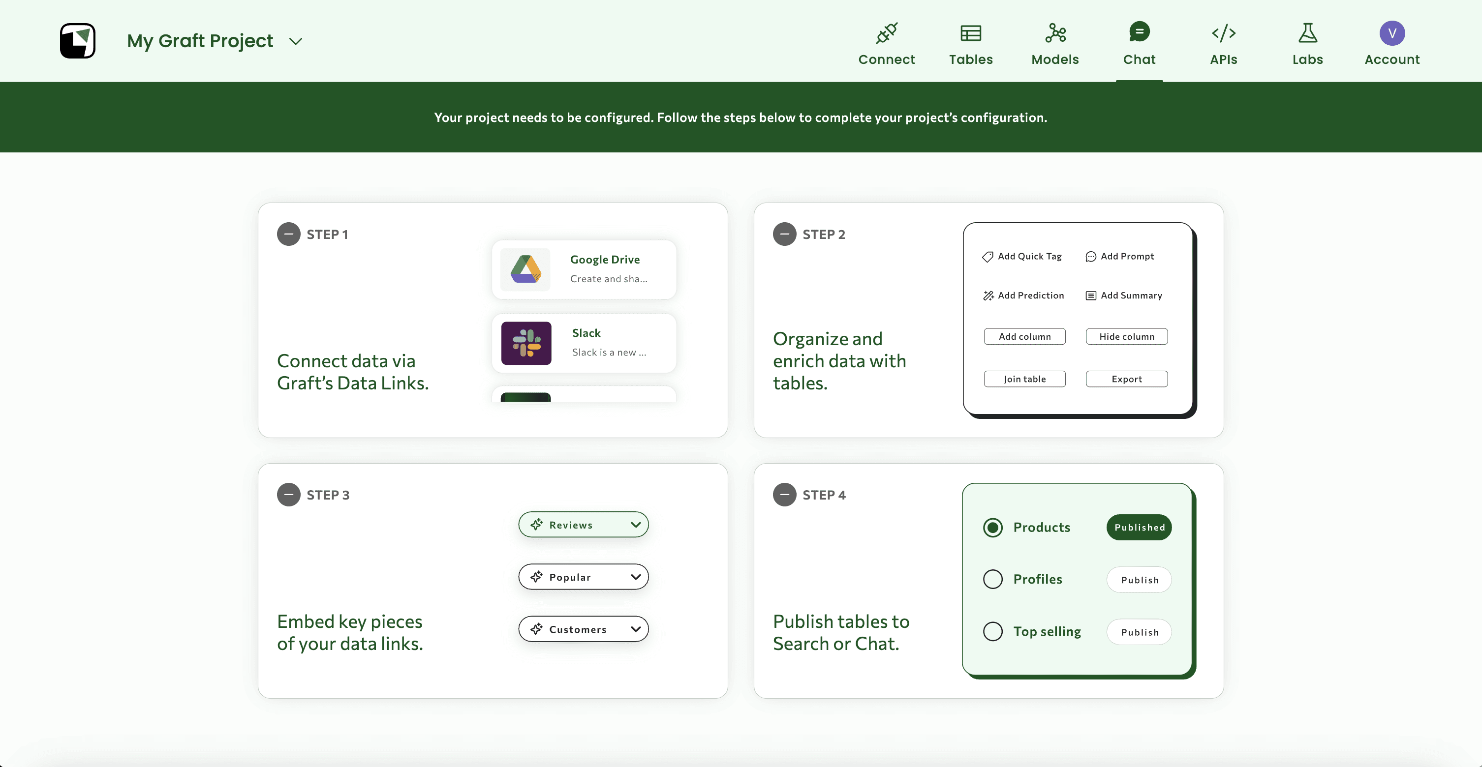
We cut through the noise and redesigned Graft from first principles. The result: a streamlined chat + search interface, supported by role-based UX. We defined three key personas: Amanda (The Data Analyst): Sets up projects and connects data Jason (The IT Admin): Oversees access, security, and setup Sally (The End User): Asks questions and consumes insights Each role got tailored flows and scoped responsibilities, no more “one UI fits all.” “Letting go of past work is hard. But clarity demands courage.” We also shifted from open-ended flexibility to intentional scaffolding, guiding users to value with fewer decisions and clearer mental models.
Ego-Free, Engineering-First Collaboration
This was possibly our last chance to get the architecture right. I partnered deeply with engineers, not just to validate feasibility, but to interrogate past decisions. We revisited the foundations: why the embedding flow felt so cumbersome, why the data connection process was hard to complete, and what technical decisions had calcified into bad UX. “You can’t simplify without confronting complexity. This was ego-free, curiosity-first design.” Together, we made surgical cuts, removing features that felt irreplaceable until we asked why enough times.
Hands-On Execution
We started with whiteboard sketches that I turned into low fidelity wireframes in Figma, and began implementation immediately. I worked one sprint ahead: designing progressive disclosures, edge cases, and fallback states. I jumped into code to refine empty states, simplify logic in key views, and polish interactions. “Design wasn’t a handoff, it was a handshake, every step of the way.”
The redesign wasn’t about minimal UI. It was about system design that filtered noise and surfaced meaning: → Created a feature audit framework with our ML scientist → Evaluated all AI capabilities (e.g. hybrid text search, semantic image search, re-ranking, embedding model selection, custom enrichments) for clarity and value → Shifted interaction patterns: power moved from modal-heavy flows into clickable column enrichments directly within the table UI → The result: a system that preserved AI power while reducing friction.
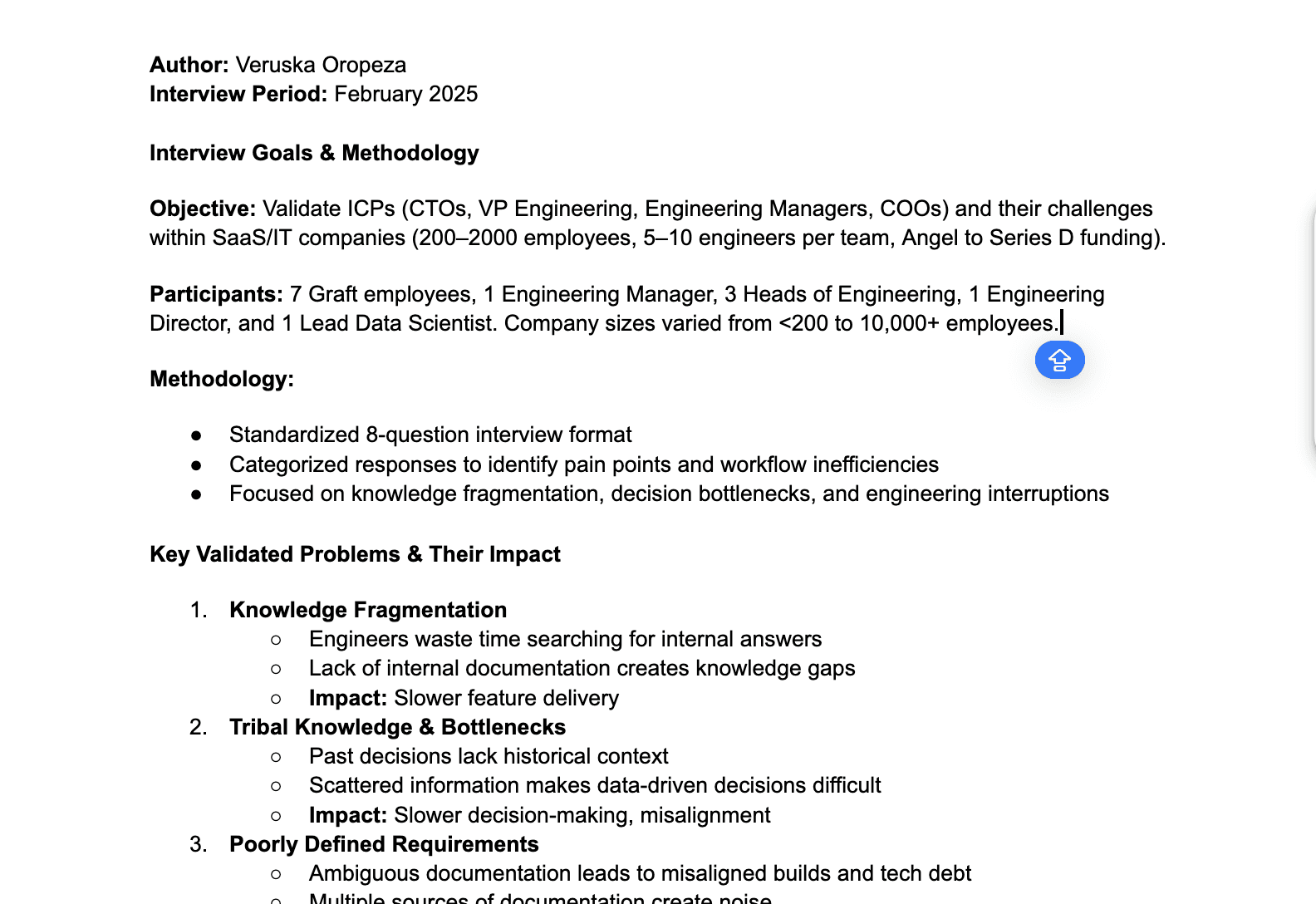
After the redesign, the team focused more aggressively on finding product-market fit. That required GTM to narrow down the ICP, and I stepped in to help. I led a round of interviews with engineering leaders (an emerging focus area) to understand how their teams worked, what problems they faced, and where Graft could fit. This research supported Sales in qualifying leads, guided product in validating next steps, and ensured our efforts stayed grounded in real user needs.
Even though Graft didn’t reach product-market fit, this redesign: Became the foundation for agent-based demos that resonated in GTM conversations Helped clarify value props in sales and onboarding flows Reduced engineering churn by removing feature bloat and dead-end UX Gave the team the confidence to say this is what we do, and pursue a sharper ICP
Great AI UX is architecture, not interface System thinking means curating what users see, and what they don’t Clarity comes from saying no, not adding more options Design is strategic editing: knowing what not to show is as powerful as what you do
